Aircraft Turnaround Management
Designing an enterprise-grade application to help airlines reduce controllable flight delays.
dashboard
capstone project
About aircraft turnaround management
Aircraft Turnaround Management is an enterprise-grade application that uses real-time avionic data to prevent flight delays during turnaround.
Role
UX Designer
March - June 2020
Responsibilities
Primary designer for Flights view
PM for research phase
An aircraft turnaround (turn) consists of preparing an arriving aircraft for its next departure by completing activities like cleaning the aircraft, refueling, loading catering, and checking the exterior of the aircraft.
According to CAPA, on average, flight delays cost an airline:
A lot of these costly delays, however, can be prevented by increasing the efficiency of the flight turnaround process and recognizing potential delays before they happen.
APiJET, our sponsor, saw the current management of aircraft operations as an opportunity for reducing flight delays by utilizing the lack of real-time information between aircraft systems, ground operations, and turnaround teams.
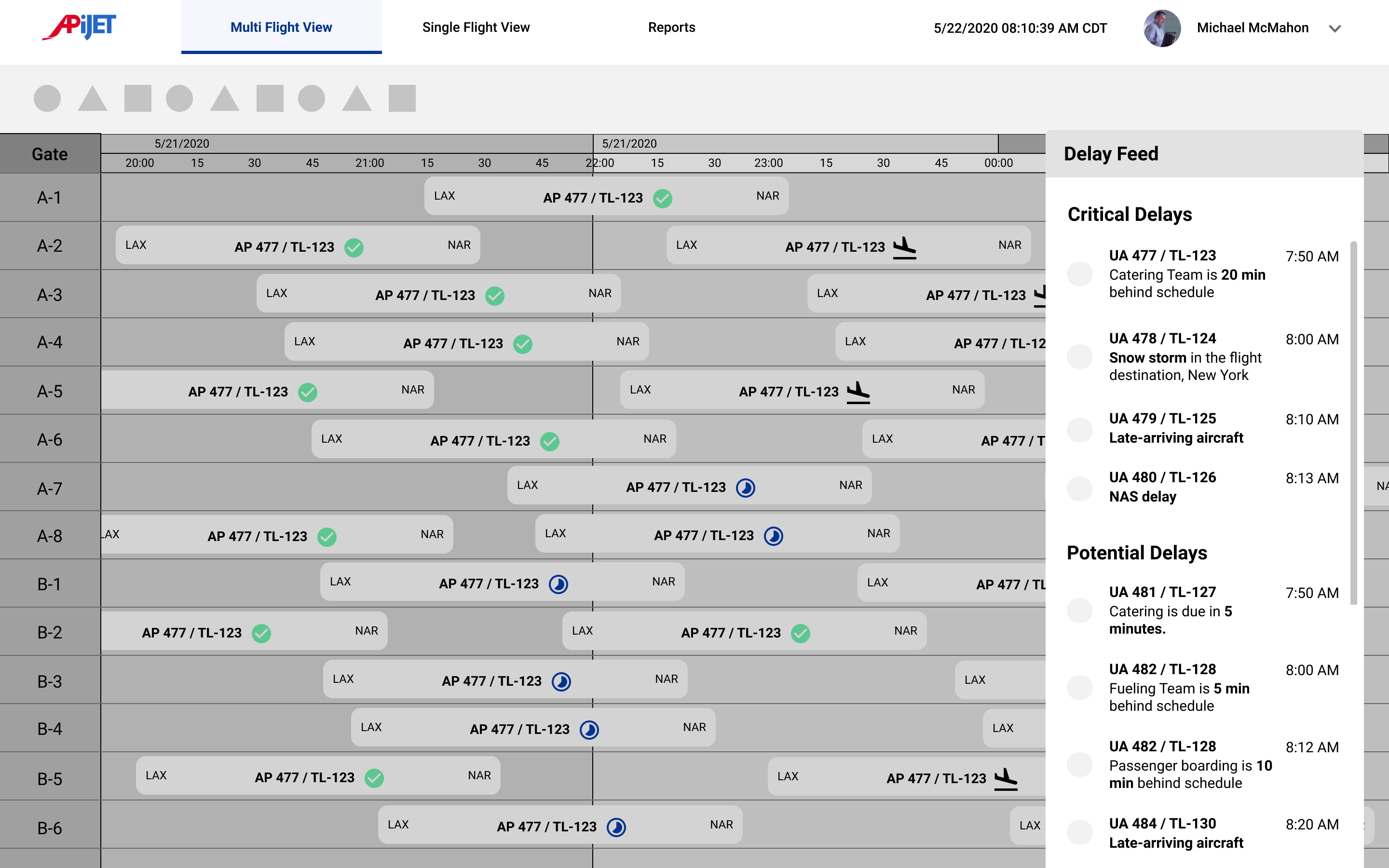
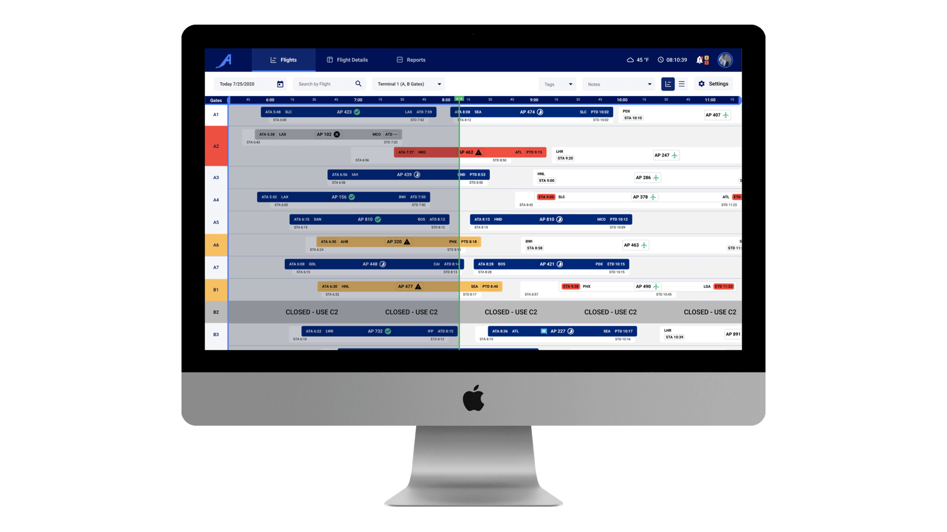
Our solution is enterprise software that sources real-time aviation data to reduce flight delays through supporting Station Operation Managers (SOMs) to easily identify delay risks and coordinate smoother aircraft turns. The product consists of three main features: "Flights", "Flight Details", and "Reports".
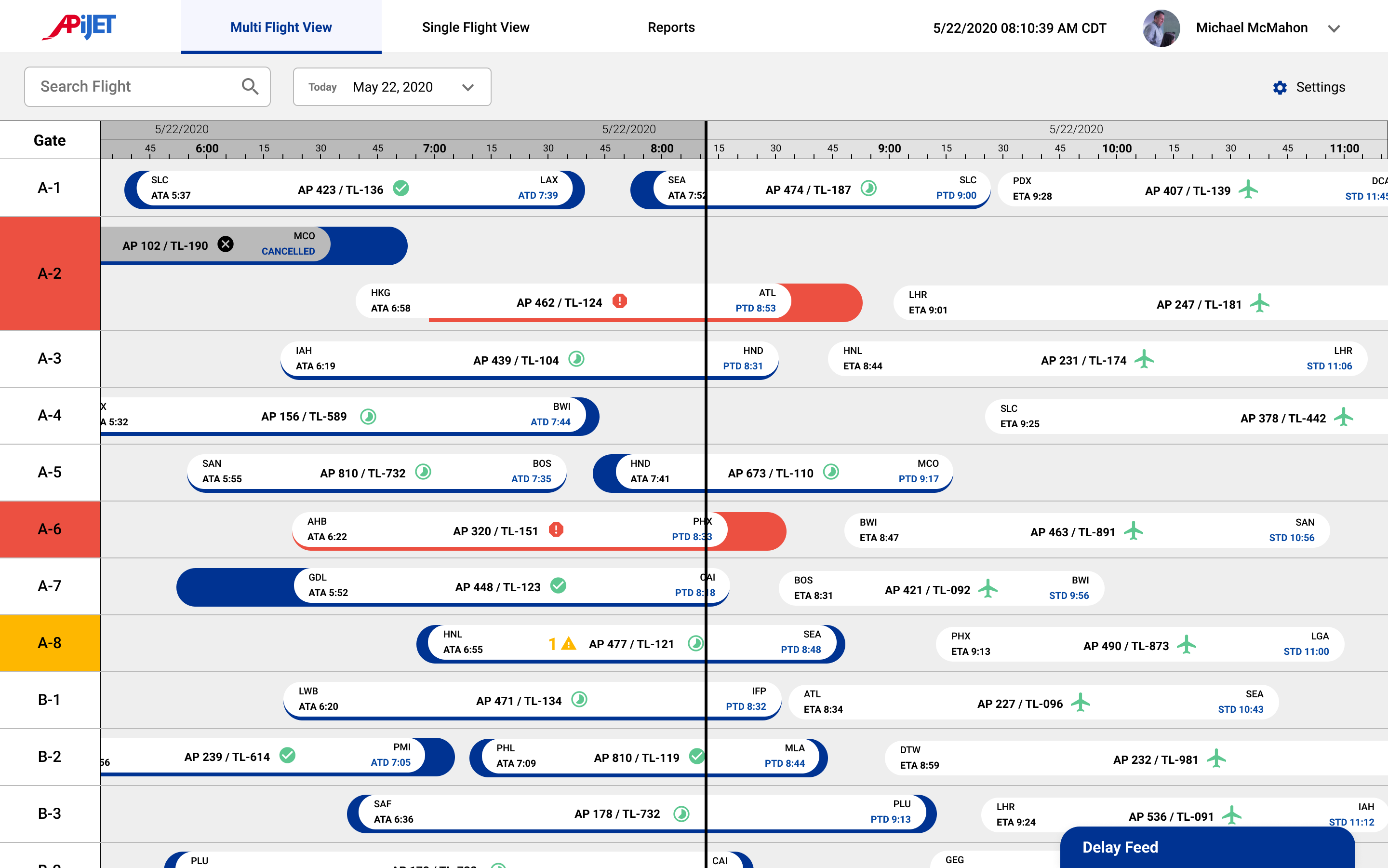
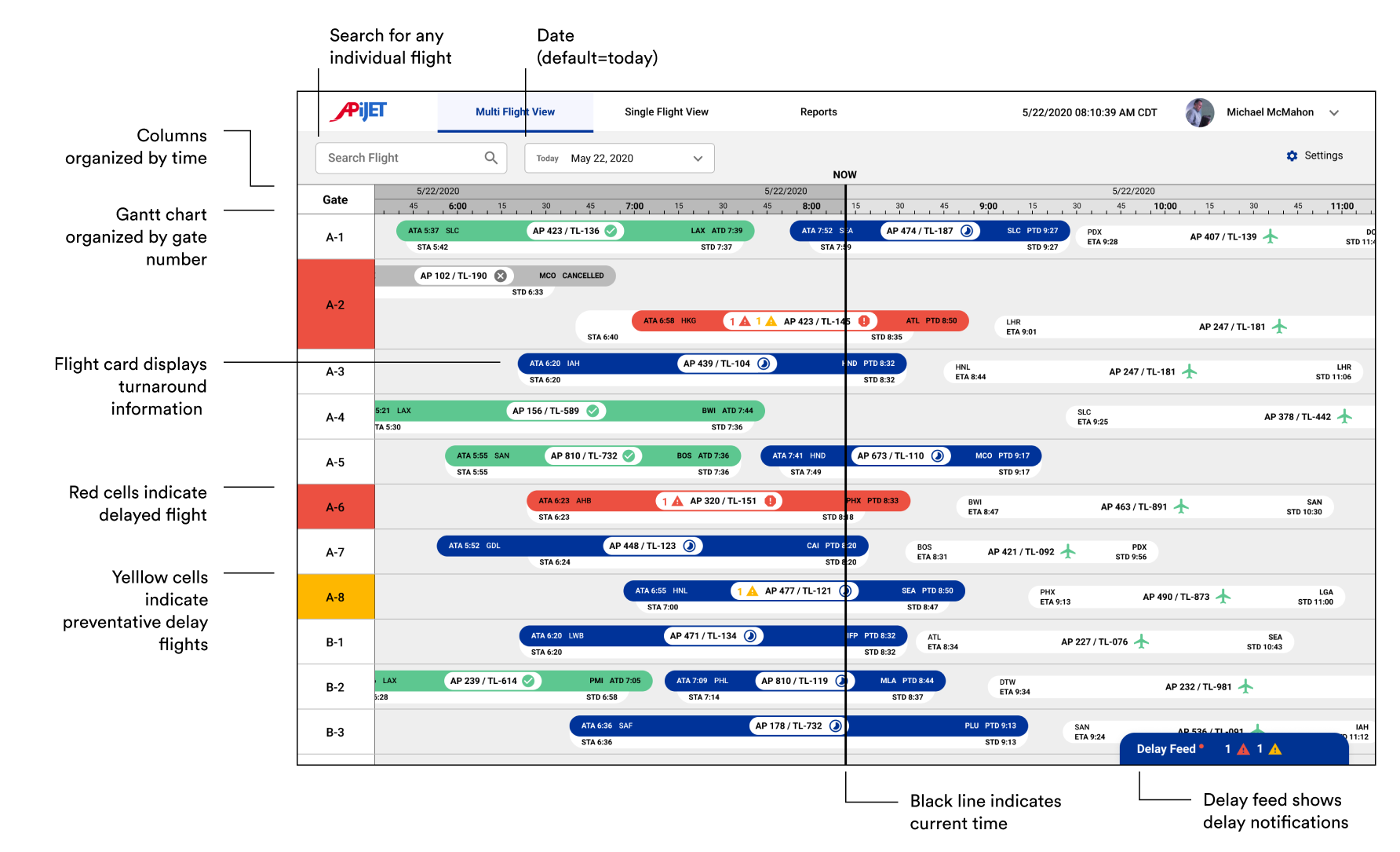
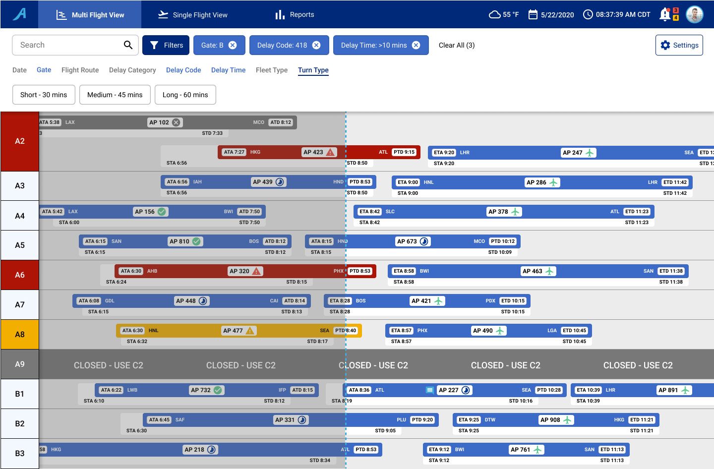
Shows all the flights that SOMs are in charge of (past, current, and future scheduled).
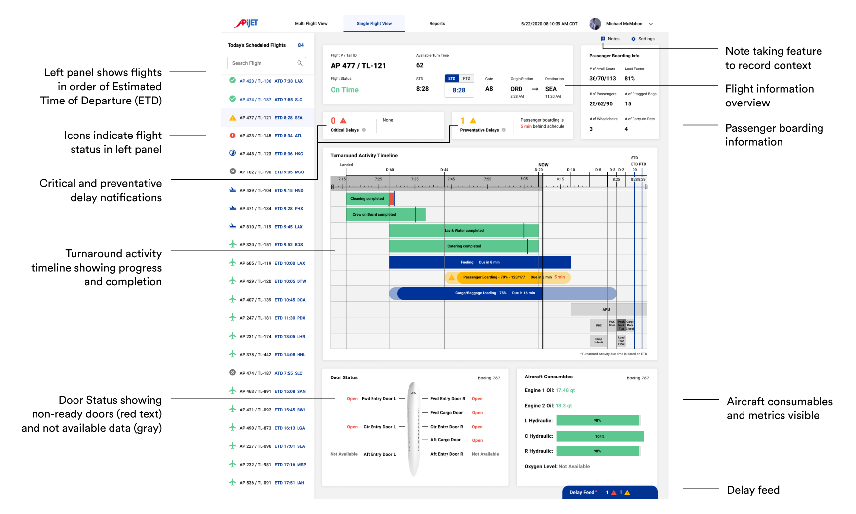
Uses a Gantt Chart and List View to show flight information, flight statuses, notifications, and delay codes.
Allows for customized information of each flight by adding tags and notes.
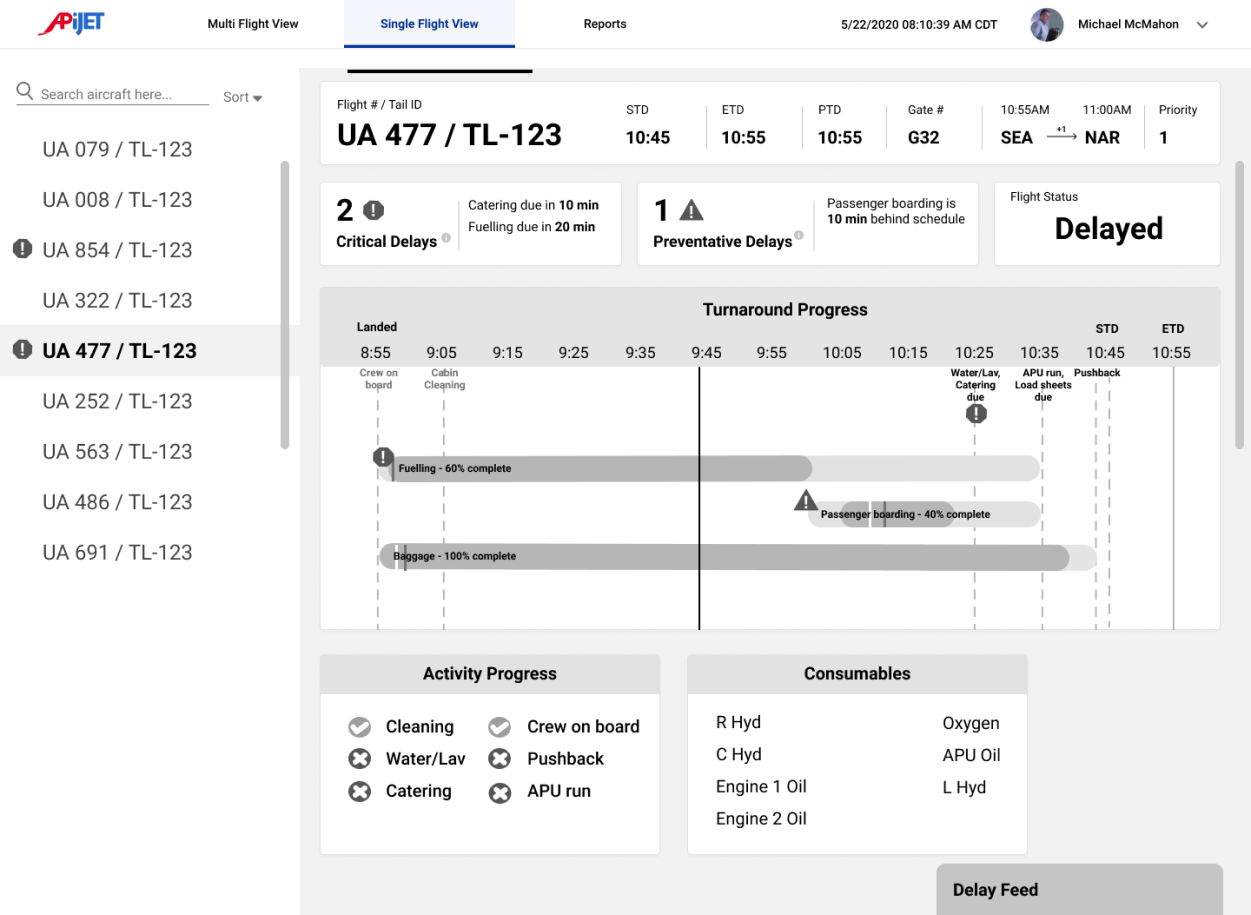
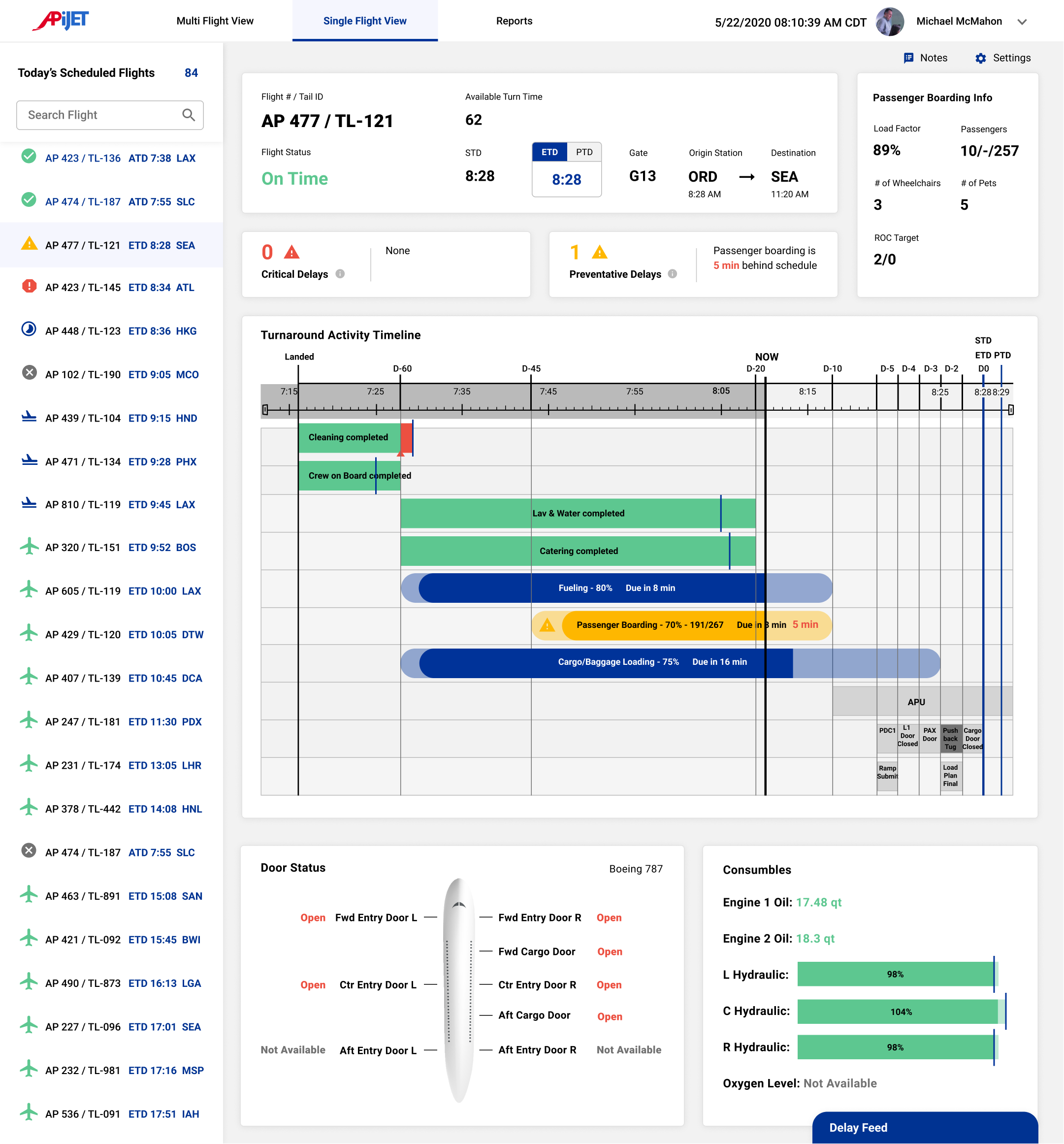
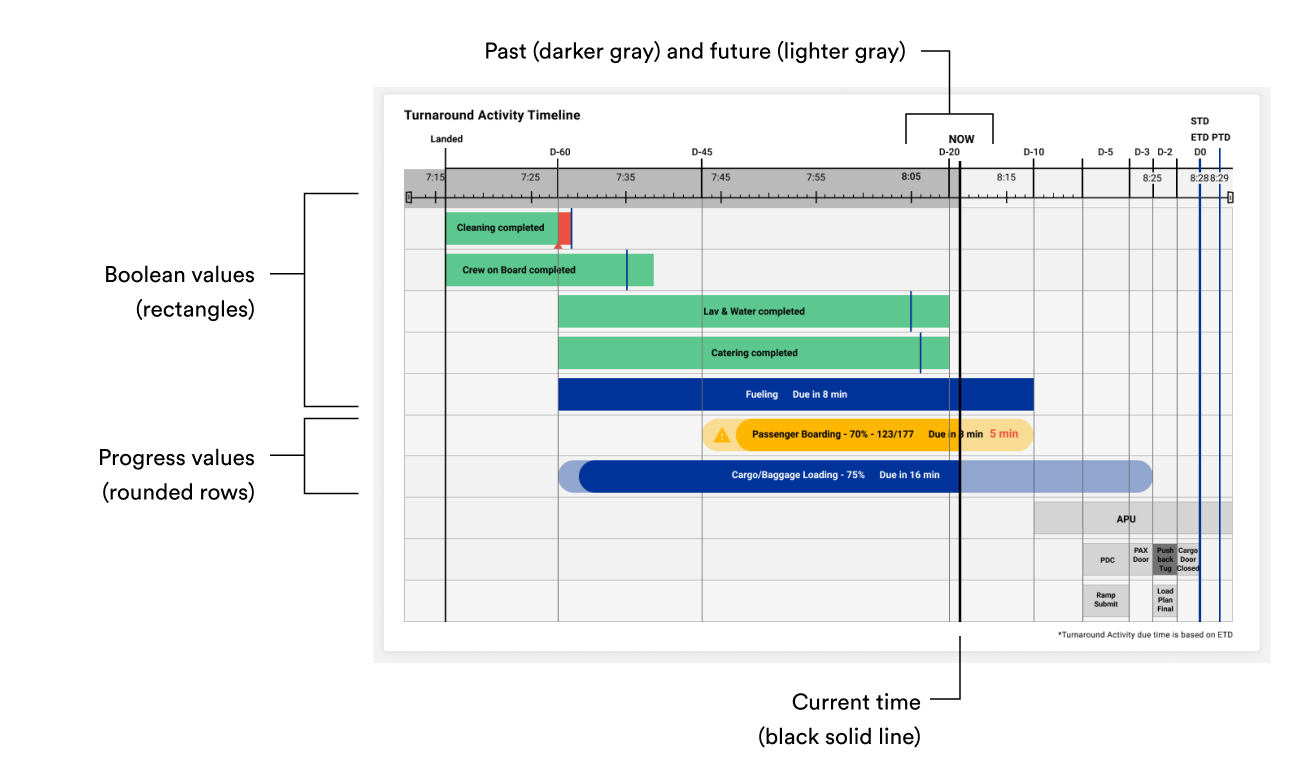
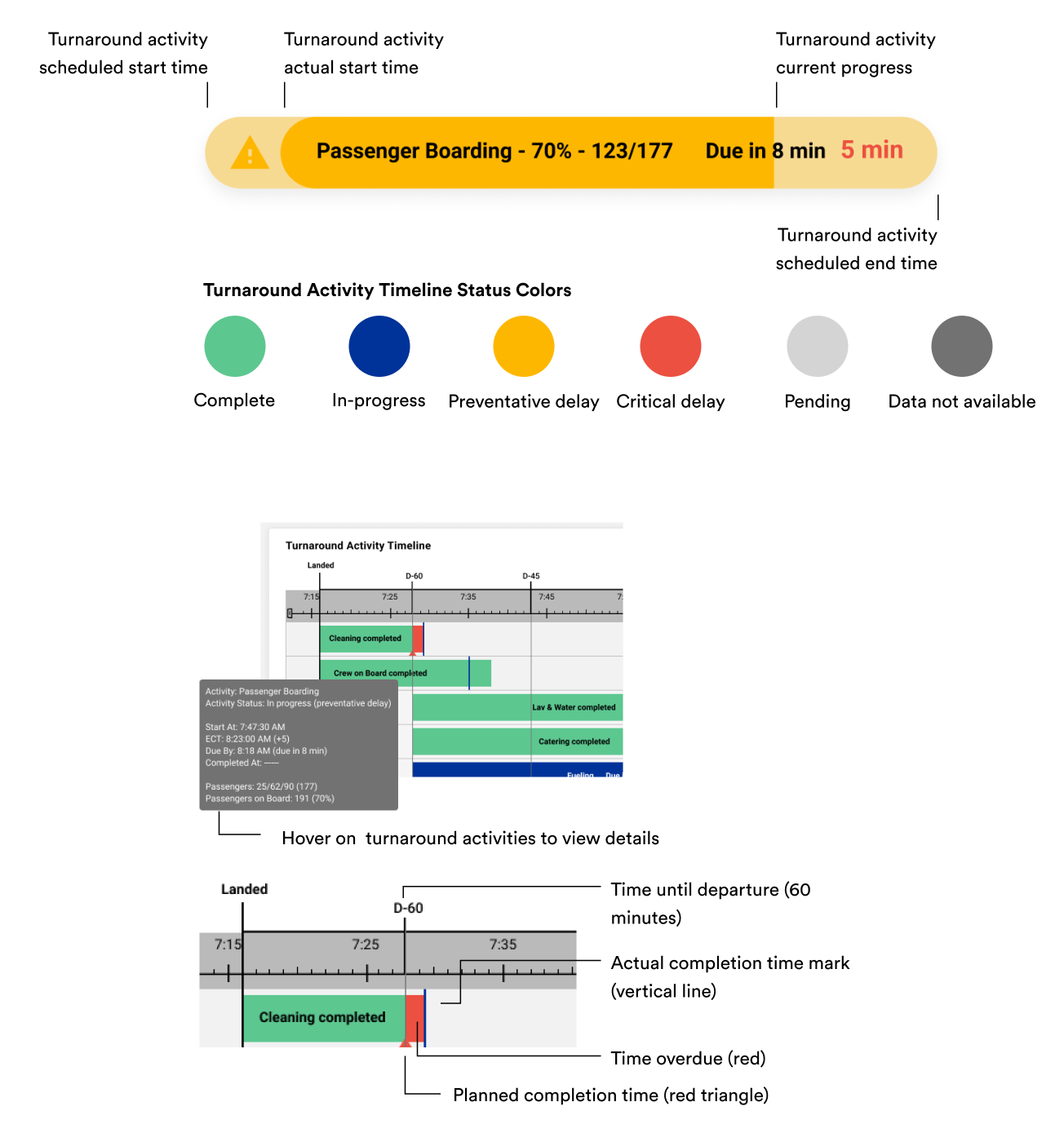
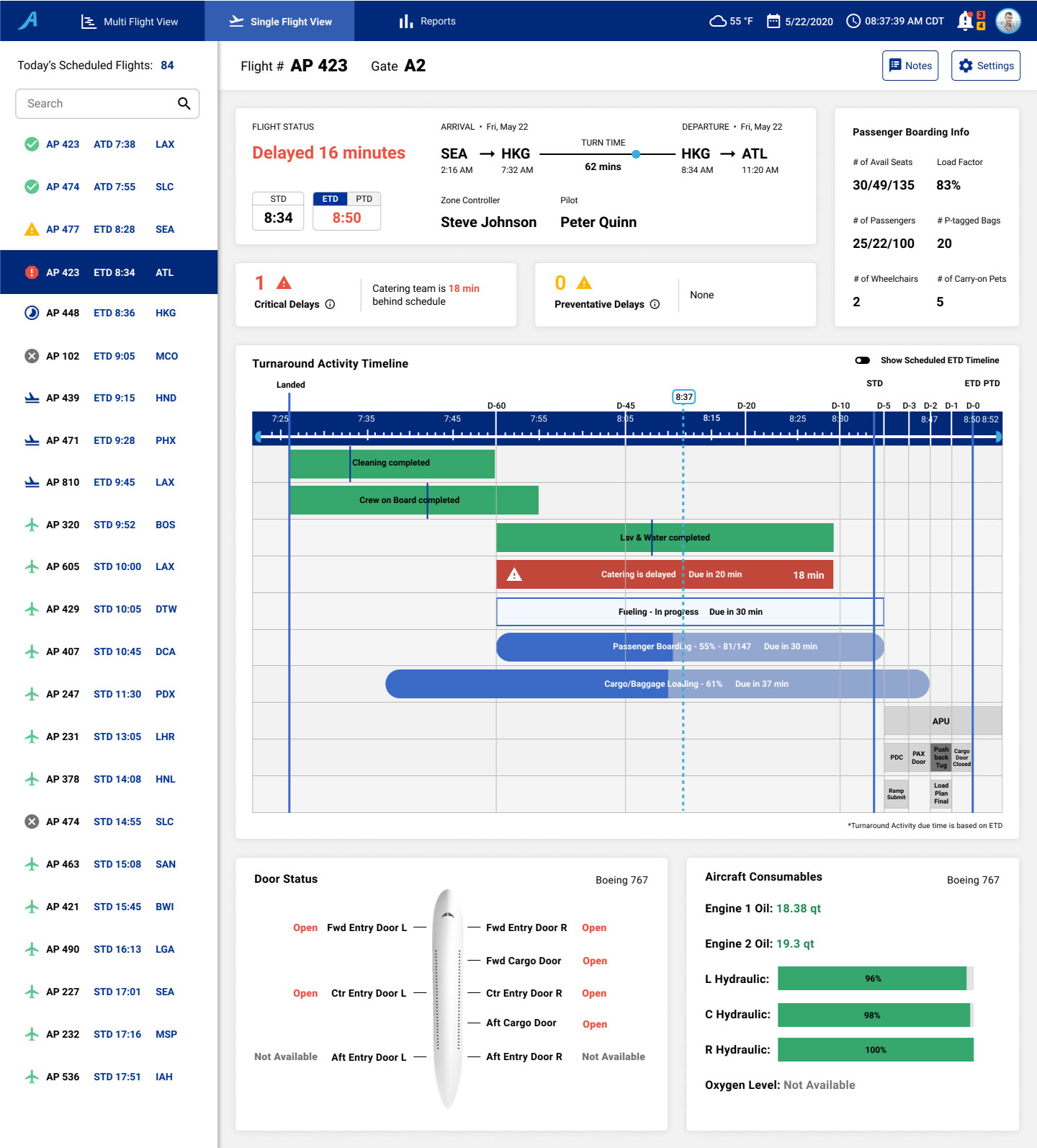
Shows the progress of each turnaround activity.
Alerts the SOM that a turnaround activity is falling behind.
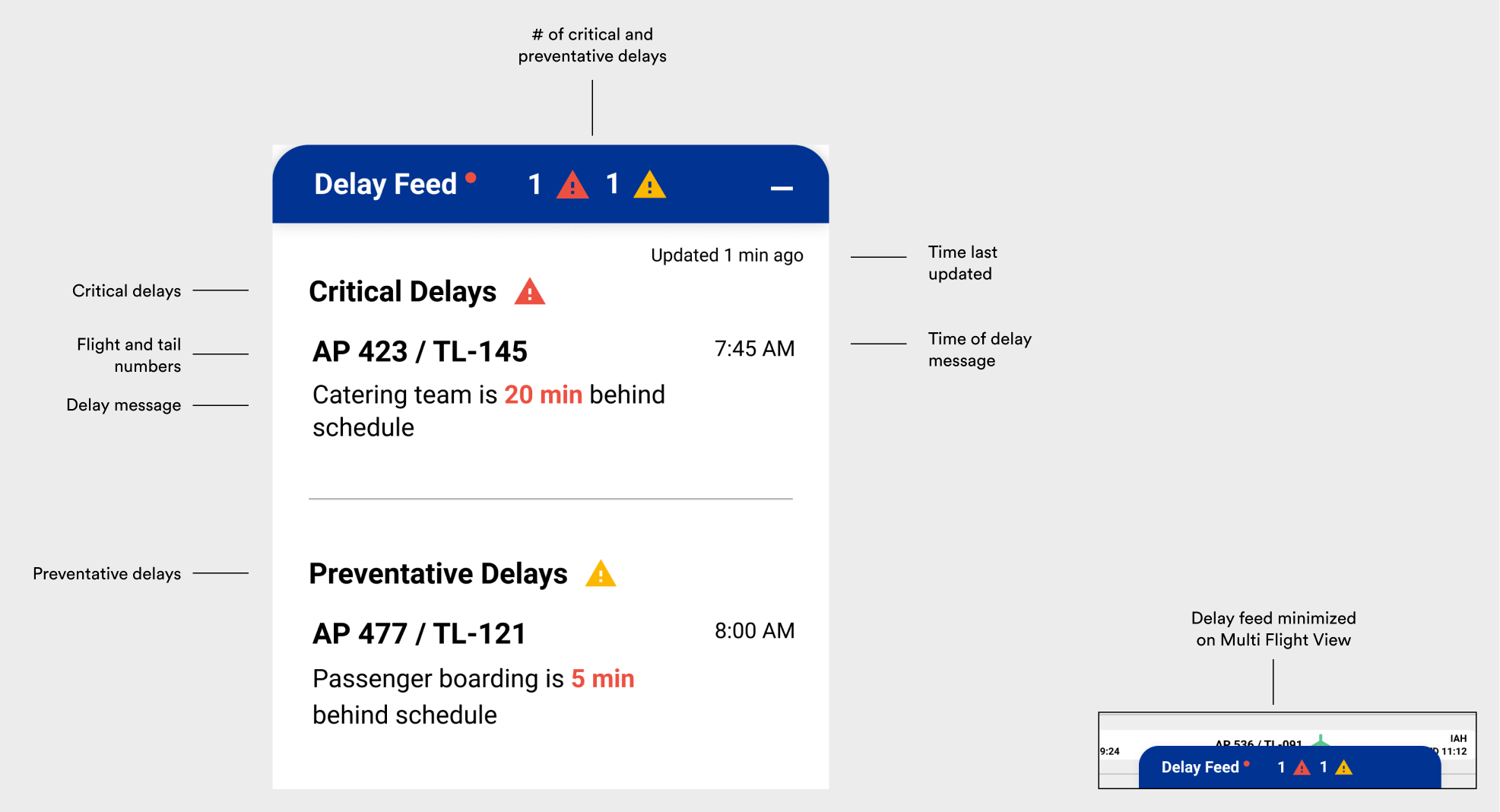
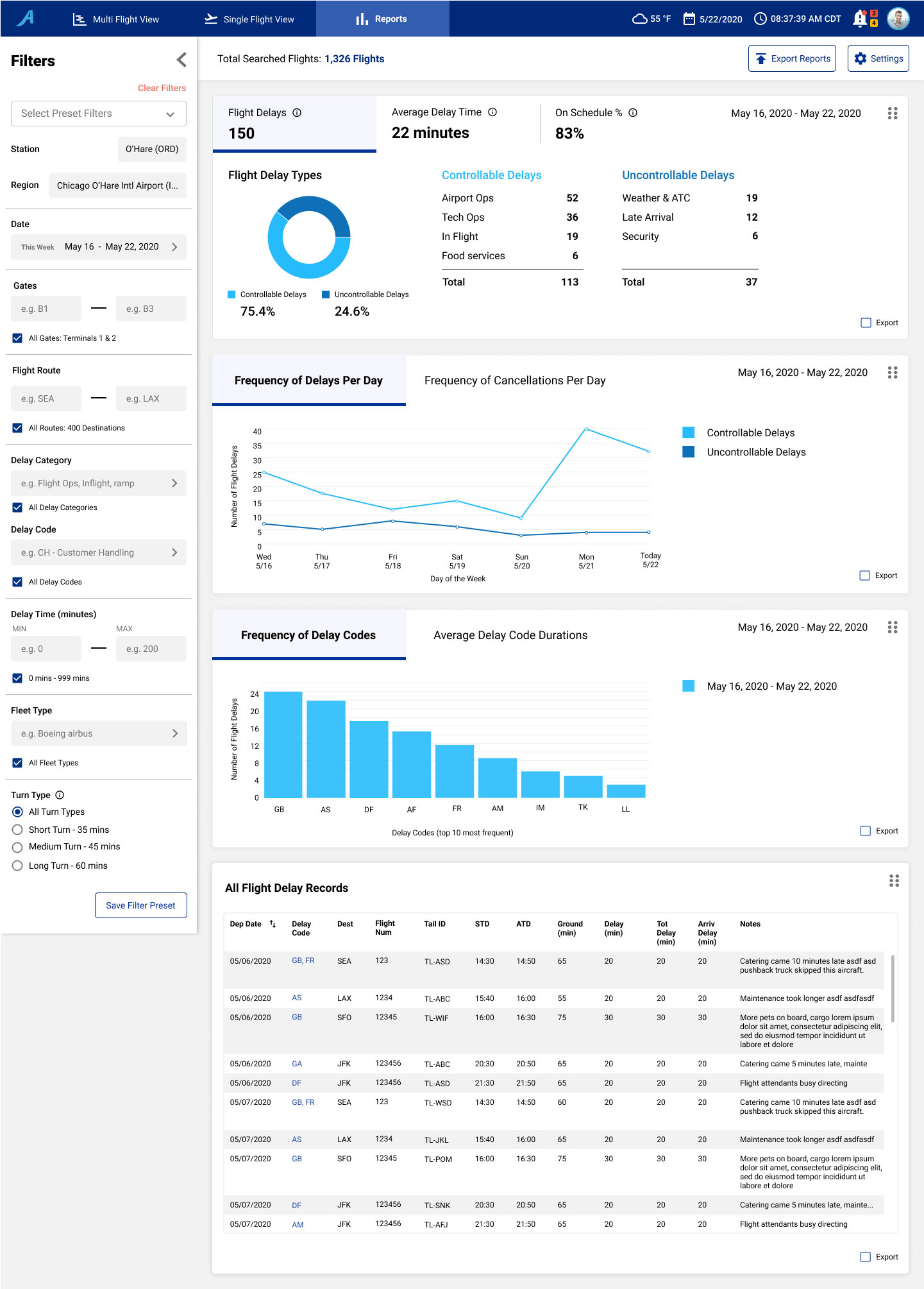
Shows detailed information about passenger boarding, critical and preventative delays, door statuses, and aircraft consumables.
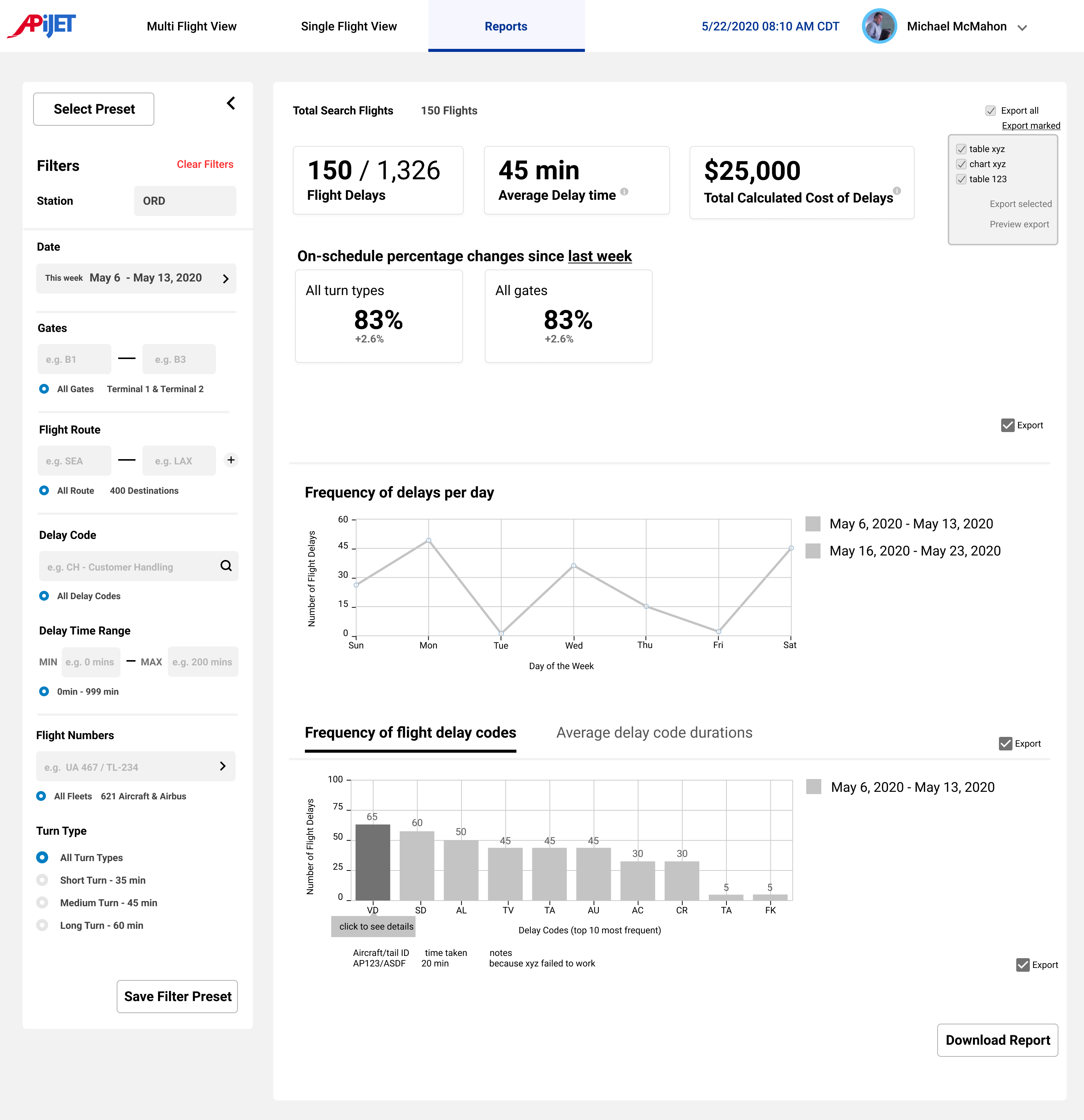
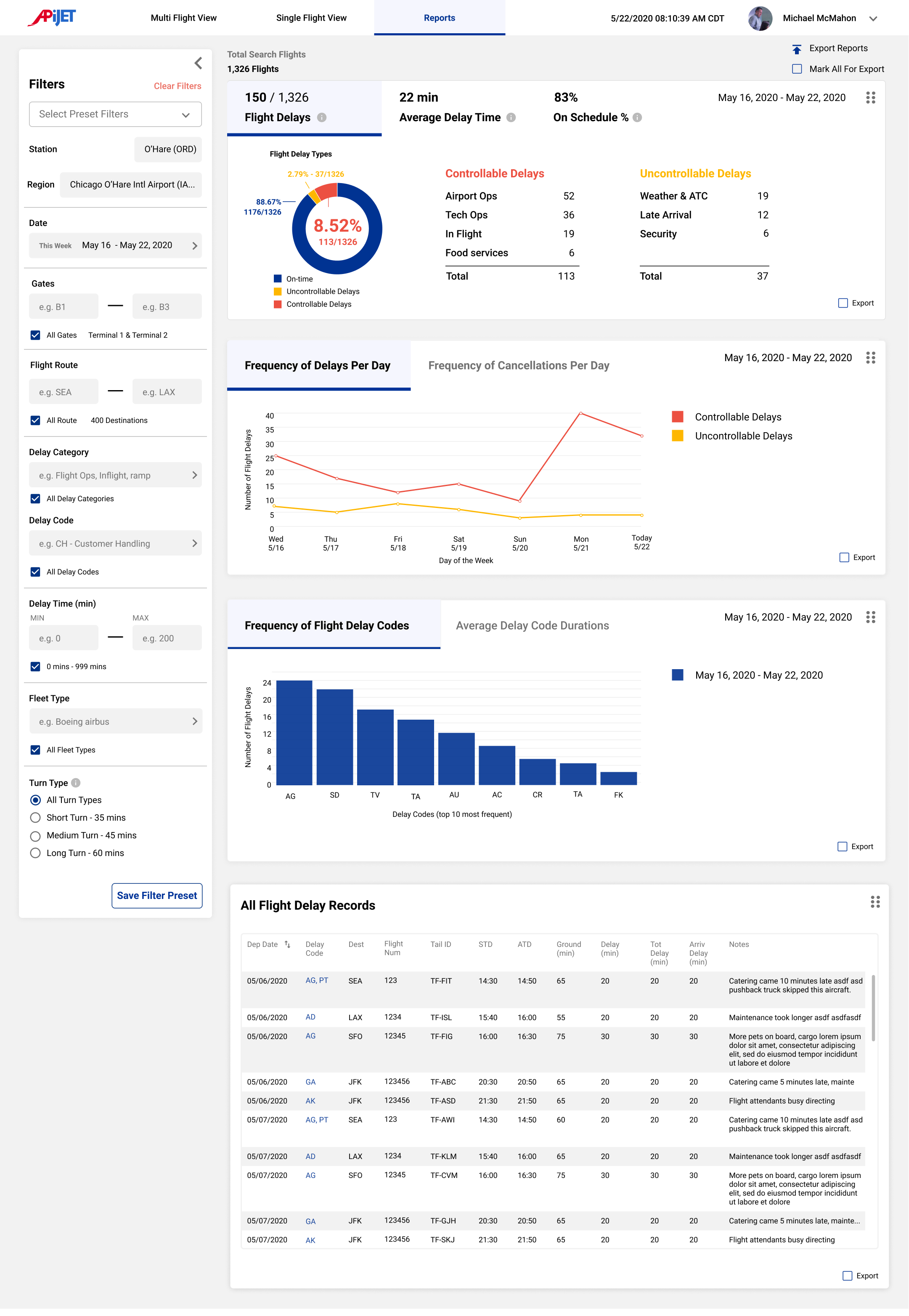
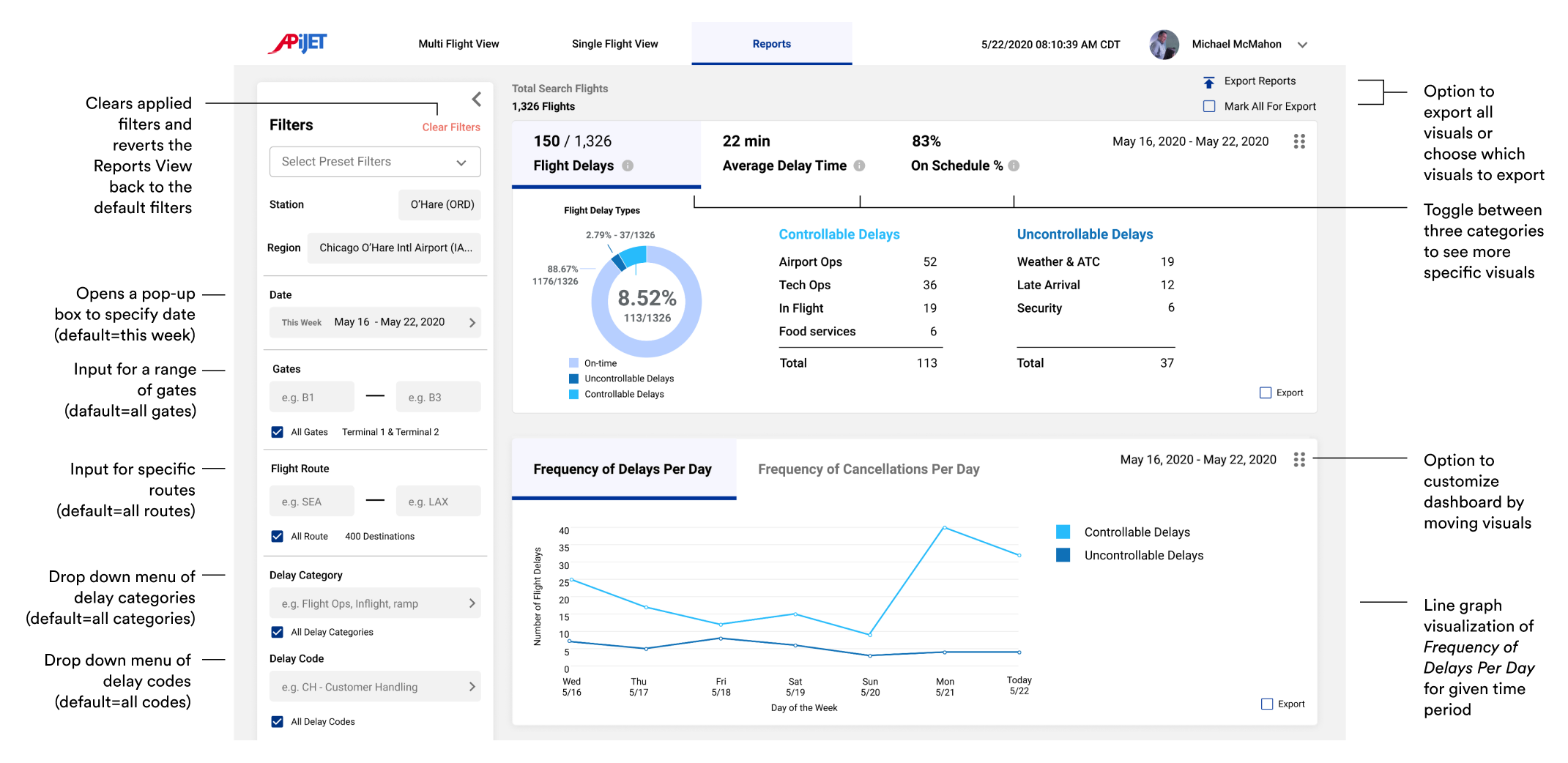
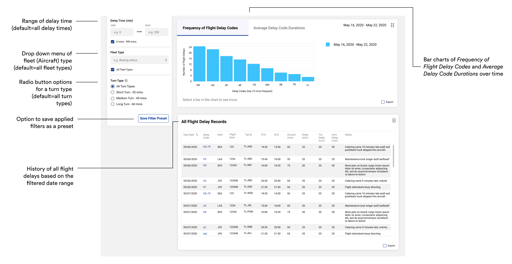
Provides relevant visualizations to show the common delay causes, average delay time, on-schedule percentage, and all flight delay records.
Allows for comparison of delay information between two different date intervals.
We interviewed 9 stakeholders to gain a general grasp of the complex airline industry and to learn more about the context of our problem space and opportunities.
We received permission to audio record each of our interviews. Each interview was then transcribed, deductively coded, and organized in an online notes tool, Miro.

Stations Operations Manager (x1)

Pilot (x2)

Inflight Leader (x2)

APiJET Subject Matter Experts (x4)
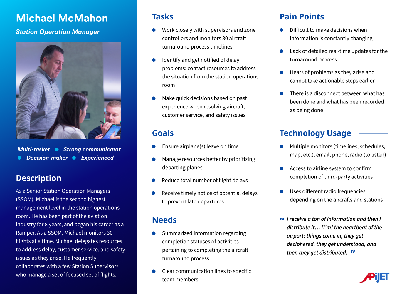
The most important thing to know is who and what the resources are to address issues
“I would say the most important thing to know is, who and what your resources are. I'm not supposed to know everything... I'm the top of the pyramid when people have operational issues. I need to know who to call to get it resolved or what to do to get it resolved.” (SOM)
Focus on monitoring high-level information to make operations smooth for the few hours in the future
“I'm probably looking at a window of four to six hours in advance with a lot of my work. And then I do have to reach out and find out what happens, you know, in the last hour, but my supervisor should be handling that type stuff. And I'm looking probably--I'm trying to prepare us for making sure we have a smooth next few hours.” (SOM)
Focus on higher-risk flights
SOMs and Inflight Leaders focus on higher-risk flights which tend to have pets, guests with disabilities (wheelchairs), excess cargo, VIPs, and during particular seasons.
Predicting delays are based on experience and historic knowledge
“I base it [predicting delays] on historic knowledge. There are certain flights that give us problems that I need to...that I feel like I need to ask our leadership to be present to.” (SOM)
Proactive communication prevents delays
“The pilots, you know, they have schedulers to say, "Hey, I'm missing pilot, Jennifer Johnson for flight 26 to Chicago, what's going on?" "Oh, I don't know. We'll give them a call." That's a way to be proactive and hopefully save a delay.” (SOM)
SOMs need to understand where delays originate
SOMs want to visualize the delay time of turnaround activities in a timeline.
The ATCM helped visualize a turnaround stakeholder's needed information, and information they can update. The ATCM helped improve our confidence in available data and credibility of sources.
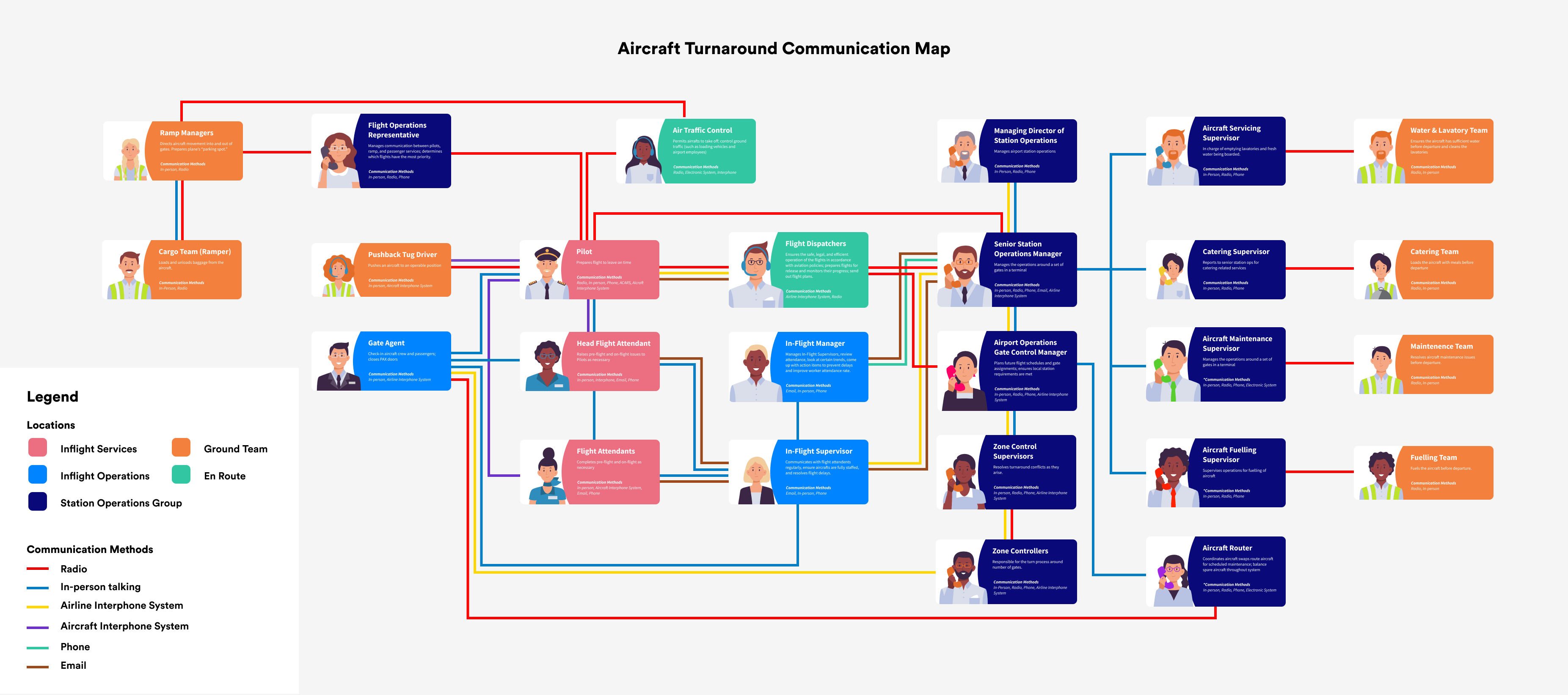
SOM's manage the various turnaround teams to the best of their abilities to ensure flights leave on time and are delay-free. They receive a ton of information through their various resources, decipher the information, then distribute tasks and responsibilities.
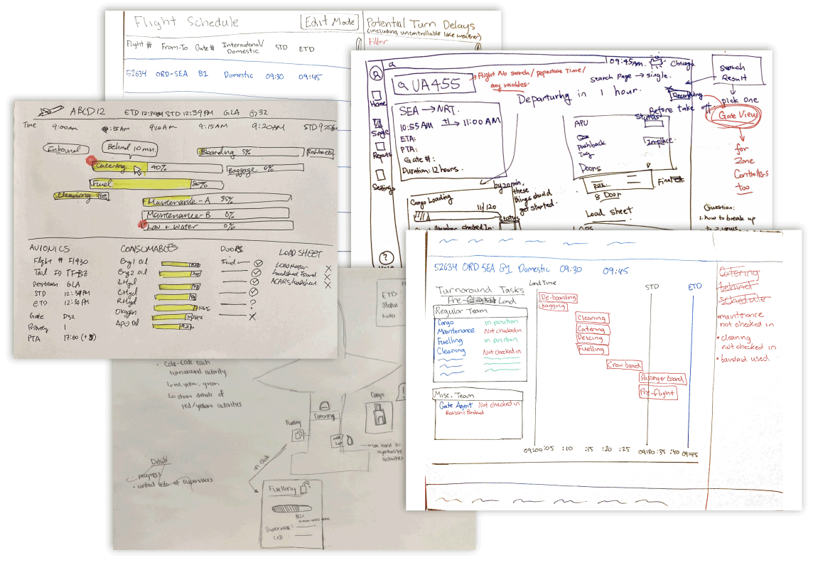
From our research, we were able to deduce potential user needs and limitations of APiJET’s current Turnaround Management application. Synthesizing the findings from the research, our team developed Design Requirements for Stage 1 of the product: Viewing Information.
Based on our design requirements, we created the information architecture to organize the interaction flows and features for the SOM's view of the application.
.png)
After completing our high-fidelity mockups, we did a usability testing session with an SOM as well as received feedback from our sponsor, APiJET. We identified 3 main improvements:
Feedback:
The Flight Turnaround Cards had different colored bars that caused confusion. The SOM thought the blue bar represented the scheduled time and the white bar represented the actual time because of their prior experience with a similar tool. However, we intended for the colors to represent the opposite.
Improvement:
Our final design uses blue bars to show actual times and progress, and white bars to indicate scheduled arrival and departure. To make this clearer, we overlaid the blue bar on top of the white bar and labeled the arrival and departure times at both ends.
Feedback:
In both think-aloud studies, participants did not seem to notice the Delay Feed in the Multi-Flight View. Also, minimizing the Delay Feed did not provide any indication of a new delay.
Improvement:
To make the Delay Feed more noticeable, we added colored indicators on the Delay Feed Header. These indicators represent the types of delays (critical and/or preventative) and provide higher contrast to notify the SOM of a delay. Additionally, we included a red dot next to the header to indicate the presence of new delay alerts.
Feedback:
The original color palette worked well for a single data set, but adding additional data sets necessitated using different colors.
Improvement:
We created two monochromatic color schemes specifically for the Reports view to avoid any confusion or associations with colors used in other pages. This ensures that the colors used in the Reports view are distinct and easy to understand.
These are our final high-fidelity designs with detailed annotations explaining the features.

Breaking Into a New and Complex Industry
A challenge for this project was navigating the complex airline industry that doesn’t experience much change. It was a challenge to balance designing for what is comfortable for airline staff who have been doing the same thing for a long time while also being innovative.
Remote Communication
Although our project was entirely remote due to Covid-19, I think we were somewhat well-prepared as students because we often had conflicting schedules and would collaborate online. However, communication is very important when working remotely so I recommend to place more effort into making sure everyone is on the same page and to also show what you are thinking.
Prioritize Features
We received so many great feature ideas from the stakeholders and our sponsor. However, it's very important as a designer to prioritize the features based on design requirements and project goals. Therefore, we prioritized "Viewing Information" in our design, and left "Receiving and Sending Alerts" and "Suggesting Actions Based on Alerts" for future design recommendations.
Future Steps:
Think about how the application can be incorporated into the software that SOMs are already using.
Think about how the application can be customized based on the needs and goals of each airline.