Omaze UK MVP Relaunch
Relaunching an MVP of Omaze's UK Website with an updated tech stack, while simultaneously making UI/UX improvements.
mobile design
ux design
About Omaze
Omaze is a charitable fundraising startup that raises money by offering people the chance to win life-changing prizes like cars and houses.
Role
Product Designer
October - December 2021
Responsibilities
Design core pages of our checkout funnel
Design the product page components, templates and define the states
A/B test features to see what is essential to the website
Collect user testing feedback
Provide user experience guidance on headless CMS powering product page
Omaze Subprizing is a prizing model that offers additional prizes to the grand prize sweepstake. When a customer enters to win a sweepstake, they are automatically entered to win the additional subprizes. Customers are eligible to win the grand prize in addition to any and all of the subprizes.
We wanted to improve the efficiency and effectiveness of our UK business by automating our content using a headless CMS. To support this change and our recent rebrand, we rebuilt the entire UK website with a new tech stack, making UI/UX improvements along the way. With a headless CMS, a content editor can easily update our live pages, saving time and reducing the need for software engineers to manually update each new page. We also focused on mobile optimization since our user base is primarily mobile, but we made some improvements to enhance the desktop experience as well.
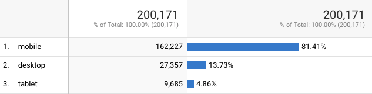
Average distribution of users per device on a weekly basis.
Current Workflow
New Workflow
Merchandising team selects the inventory
Merchandising team selects the inventory

Impact team selects our charity and develops impact content
Impact team selects our charity and develops impact content
Account Management team defines our sweepstake details
Account Management team defines our sweepstake details
Content Editors sends image and copy content to Development team
Content Editors work in our headless CMS tool to upload and edit content that can be automatically released to our live site
Development team manually codes and releases content to our live site
Results in less back and forth between Content and Development and allows Development to spend more time on higher prioritized tasks
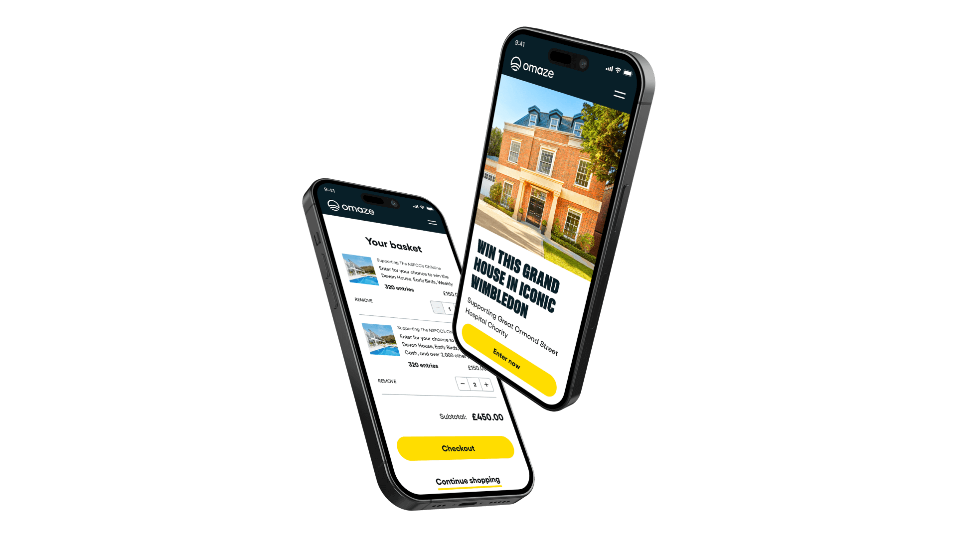
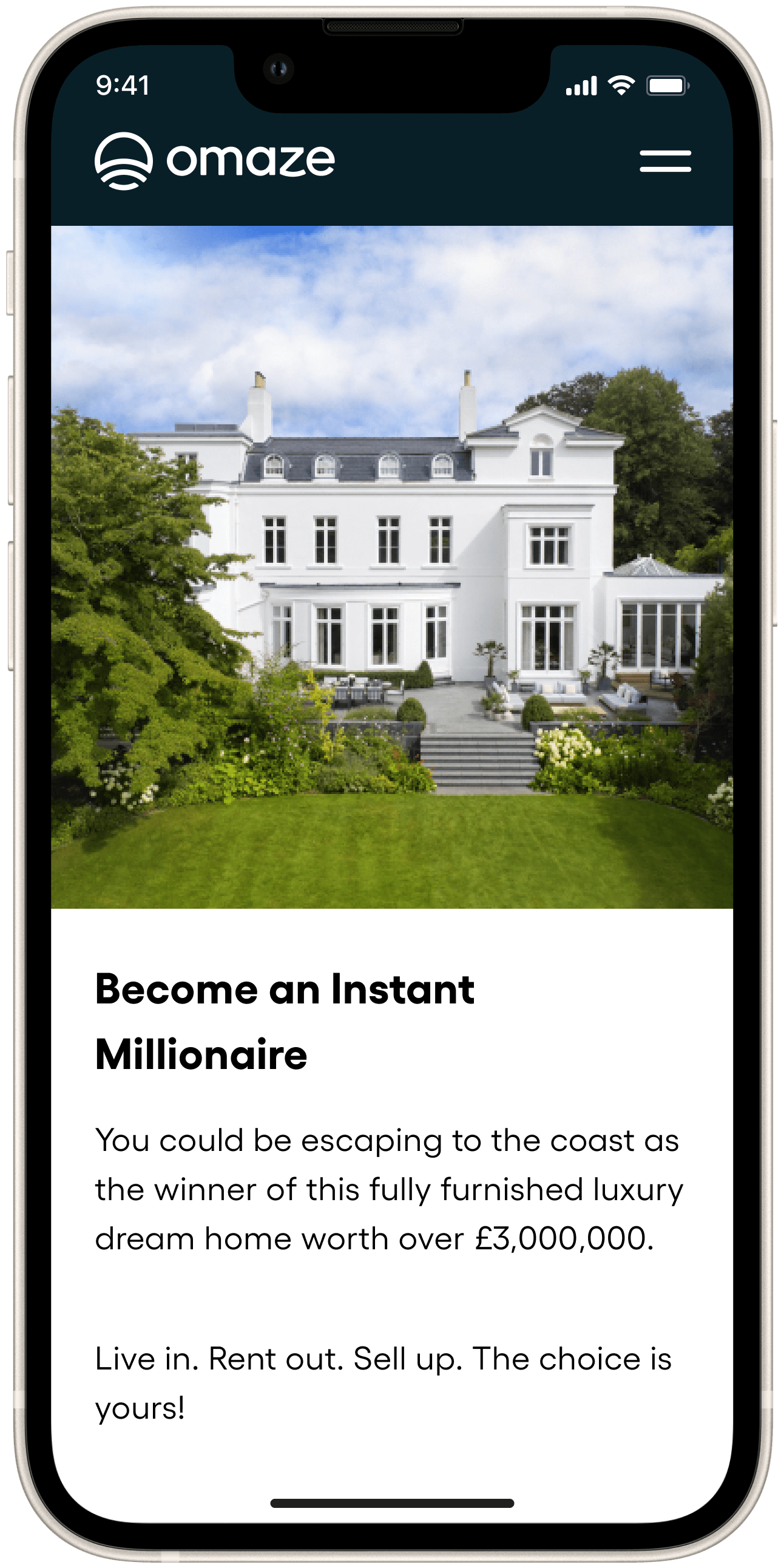
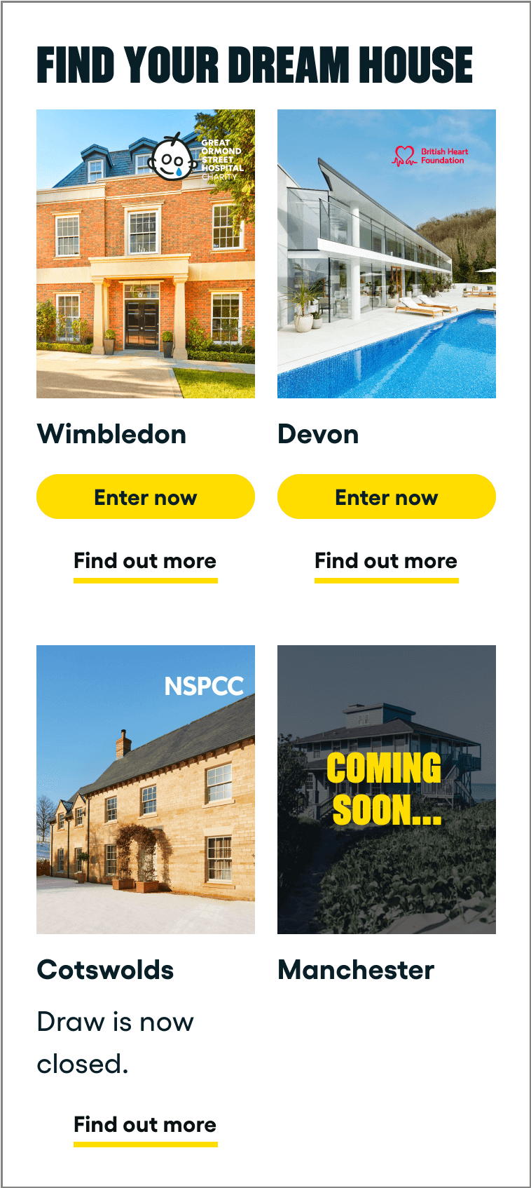
Homepage
Open & Closed Product Pages
Pricing Page
Cart Page
Checkout using Shopify
To get an initial pulse check on what was working on our homepage, we ran an unmoderated research session on Usertesting.com. Users expressed excitement from seeing large, high quality images of the prizes, which is something we want them to feel when considering donating.
Example screenshot of a page used for Usertesting.com
"Squares images remind me of Instagram"
"I like that the images are big and high quality"
"Squares images remind me of Instagram"
"I like that the images are big and high quality"
Example screenshot of a page used for Usertesting.com
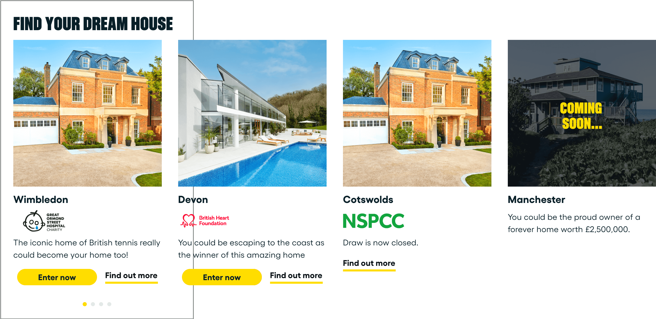
The existing placement for our charity icon on our product cards is on our main image. This presents potential accessibility issues due to poor contrast and it puts extra pressure on content editors to think about what is accessible or not. Also, by having one card span the width of the device, users are able to see more of the large, high quality images that they love.
Before: 4x4 Cards
After: Carousel Cards
Some of our components were not optimized for desktop, but some light-weight changes could be made here to improve the layout.
This Weekly Winner section (see below) is an example of one of the sections I re-worked by centering the alignment and justification of the content and applying a max width, so the text won't grow absurdly long on desktop. I was able to get this work prioritized with my PM by doing upfront work with my Development team on my ideas for the changes and working through what would be different between mobile and desktop.
Before: Old Weekly Winner Section

Old Weekly Winner section.
After: New Weekly Winner Section

Updated Weekly Winner section.
Given the tight timeline of our project and the fact that we have a low percentage of tablet users, we decided to only work with a responsive grid using 2 breakpoints: 0-1151px and 1152px+. I made the decision to have our tablet breakpoints embody our mobile designs because mobile phones and tablets are similar in usage (touch screens), which would ideally result in designs that feel familiar for tablet users. The video below is an example of some responsiveness work I made on our social-proofing In The News component using our 2 breakpoints.
Video demonstrating how the In The News component responds at different breakpoints.
For our MVP, we decided to remove the Omaze Blog and Winners pages because they were low traffic and we also found that users were often looking for winner content on our Closed Product pages. They were more interested in who won the houses they entered in instead of general winner content. This meant we needed to include more details on our Closed Product pages to better reflect these changes and the expectations of our users.
To address these changes, I designed a post-draw timeline that provides more upfront visibility of the experience lifecycle as well as displaying key information as it arrives like the winning entry code and the winner details for the sweepstake.
Draw Timeline States:
Closed

Winning Ticket Announced

Winner Announced

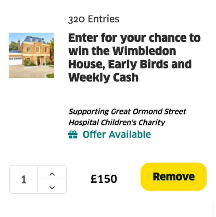
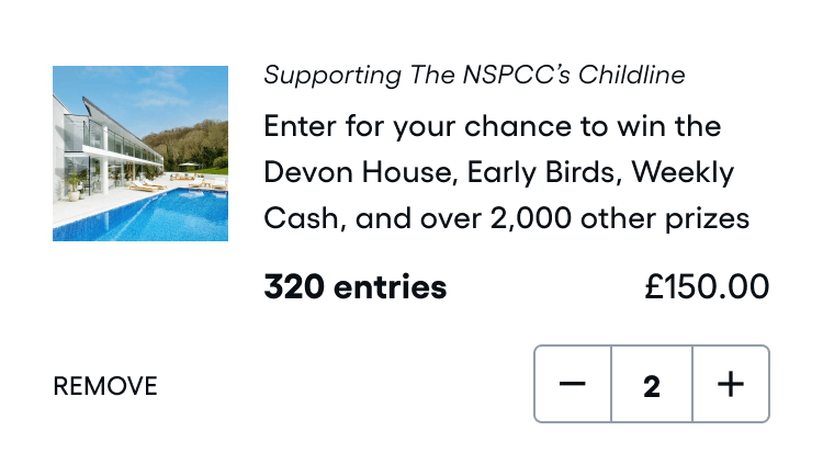
As I was working on the Donation Options, I saw that the original design could use some change. It was very cluttered and tried to do too many things in a small space. Additionally, the layout provides much more emphasis on the price instead of the product — the entries. To address these concerns, I updated the designs to reduce the visual noise and emphasize more of what the customers are buying.
V0: Price-emphasis

V1: Product-emphasis

The original cart line items had some awkward spacing and hierarchy of elements. I redesigned this component by making the following changes:
Restructured layout to emulate our standard hierarchy of product-charity content
Swapped Remove button and quantity selector and increased tap zone for quantity selector
Reduced emphasis on the Remove button by changing it from a filled button to a text button
Increased emphasis on the product they are purchasing — the entries
V0: Cart Page Line Item
V1: Updated Typography and Layout
These are our final high-fidelity designs with detailed annotations explaining the features.

Project Outcome
The MVP re-release of Omaze UK was canceled a month before release due to leadership having mixed priorities and for not recruiting a team to take over the project once it has been built. However, I still enjoyed working on this project with my team and I believe the learnings and experience is still valuable.
Prioritize Features & Collaboration
The nature of this project was very much feature prioritization and cutting scope when possible. We wanted to rebuild only the most necessary features to run the UK business, which I was on board with, but at the same time I wanted to make improvements where I thought necessary. Although we were operating under a mindset of finish fast and iterate, this led to me prioritizing UX improvements and advocating for our users where I saw fit. Through this experience, I was able to see growth in my product thinking skills, as well as communication and collaboration skills with cross-functional team members.